Shopify page builder · 2022
Onboarding that asks less and gives back more
A third of new GemPages users skipped onboarding; the rest spent eight minutes on it. Marketing still needed the answers. A usability test of my first draft showed what to cut: the shipped flow asks two questions that shape the user's first page, and moves the rest to the dashboard, behind an incentive.
- Data analysis
- Heuristic evaluation
- Usability testing
- UX
- UI
- Role
- Sole product designer
- Team
- PO, tech lead, UX lead, data analyst
- Timeline
- 2 sprints (4 weeks) · 2022
- Platform
- Web app
- Outcome
- Onboarding cut from 4 steps to 2
TL;DR
Summary
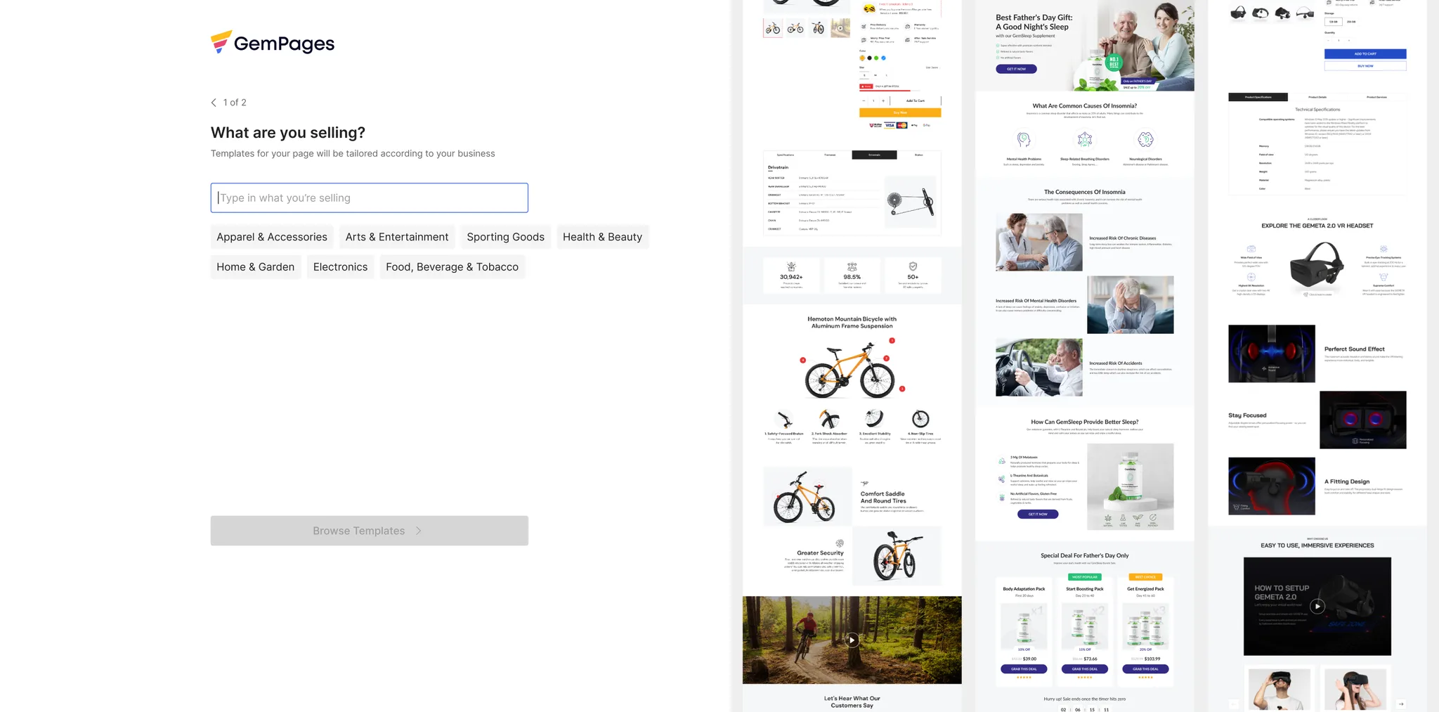
Ask only what helps the user build their first page. Ask the rest later, and give something back. The shipped flow asks two questions, each with a skip, and leads straight to the editor or tailored templates. Role and business model moved to a dashboard survey with an e-book as the reward. Age and gender were dropped.
- Skipped onboarding
- 32.2%
- Old flow, incl. bounce & uninstall · ~1 year, Google Analytics
- Avg. time on task
- 8.1 min
- Old flow, same period
- Hesitated at age & gender
- 5/5
- Usability test of my first draft, before launch
- Steps before the editor
- 4 → 2
- Old flow vs shipped; role & business model moved to dashboard
A third of new users skipped onboarding. The rest spent eight minutes on it
Users reach onboarding right after installing, still thinking about the page they want to build. The old questionnaire stood in the way: four steps, no skip once started, no hint of how many were left.
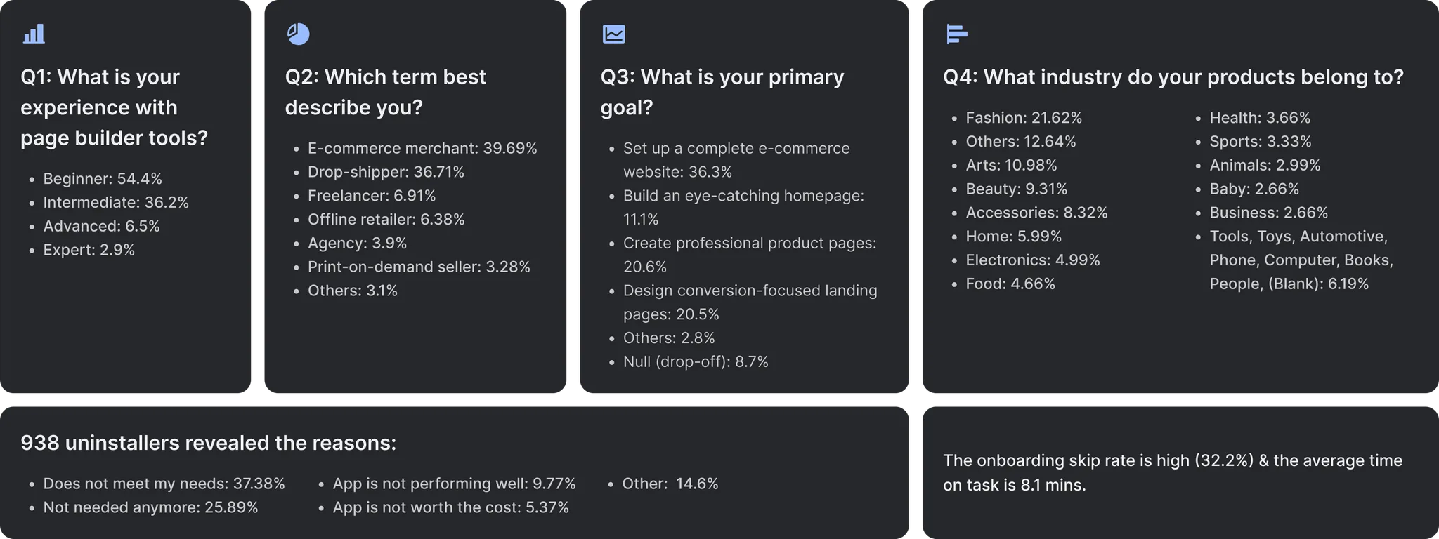
Marketing needed the answers to segment users, so removing the questionnaire wasn't an option. Yet of 938 users who gave a reason for uninstalling, 37.38% picked “Doesn't meet my needs”. We asked a lot, then didn't use the answers to show people what they came for.
32.2%of new users skipped, bounced or uninstalled during onboarding
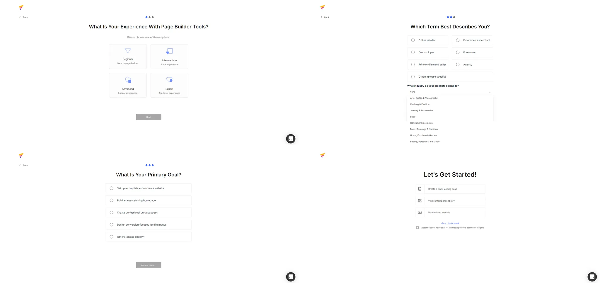
The questionnaire took information and gave nothing back
A year of answers was already in our tracking, so I started there instead of with new interviews. With the data analyst, I pulled answer and drop-off data and ran a heuristic evaluation of every step. Personas came from the data team's earlier work.
01
Nobody knew why they were being asked
Experience level and business type changed nothing the user saw next, so the questions read as data collection.
02
The options didn't match how merchants see themselves
“E-commerce merchant” and “Offline retailer” overlapped. Single-choice, jargon-heavy options made people guess; “Others” was the second most common industry.
03
No way out, no end in sight
Users couldn't skip or see how many questions were left, and the last step offered four more choices before letting them in.
Typeform got right what three page builders got wrong
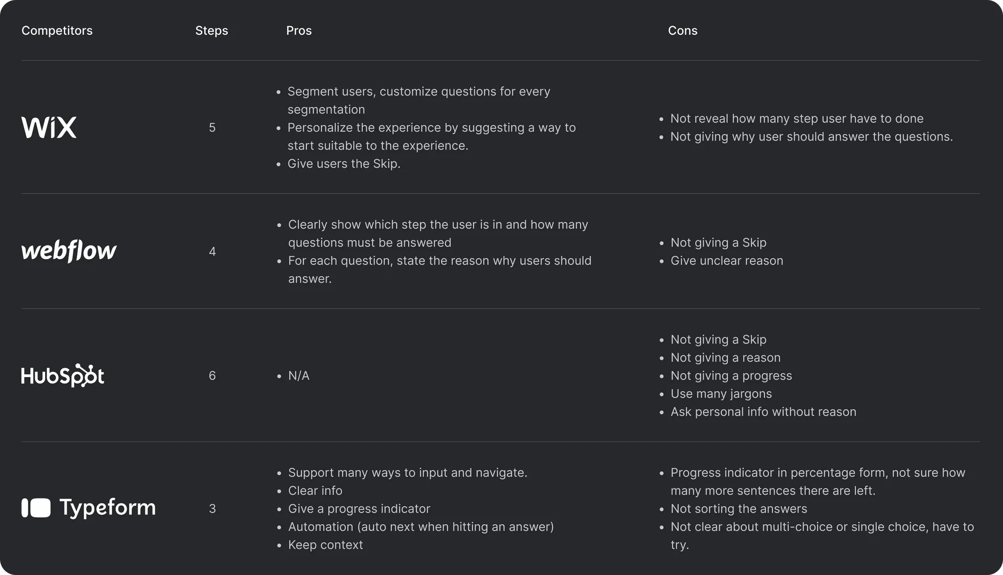
I went through the onboarding of Wix, Webflow and HubSpot step by step, plus Typeform as a best-practice reference. Each builder missed a skip, a progress count or a reason to answer. Typeform had all three, in three steps.
My first prototype took those patterns: three steps, progress, a skip, and a reason under each step. But it still carried everything marketing wanted, including title, age, role and business model.
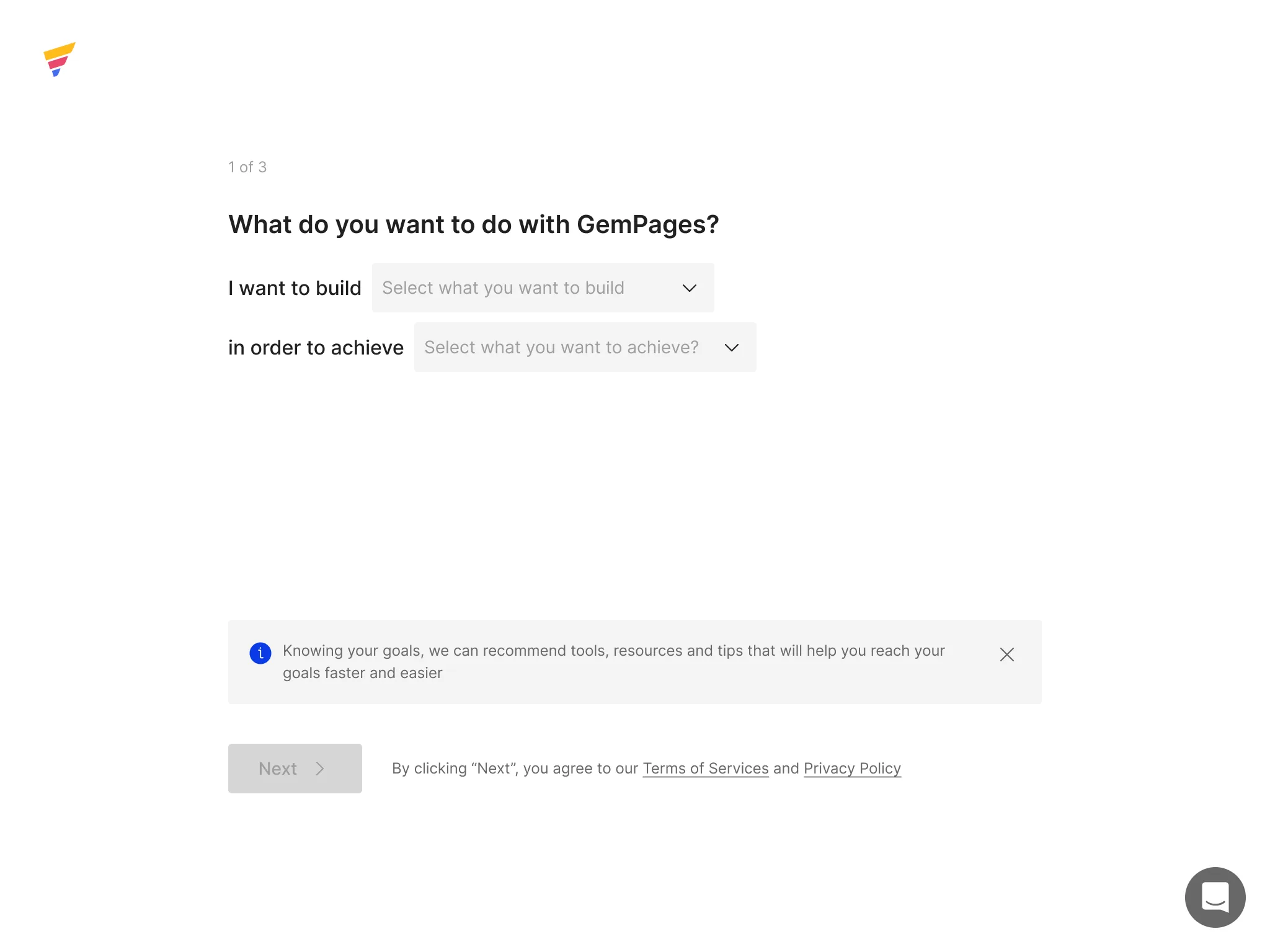
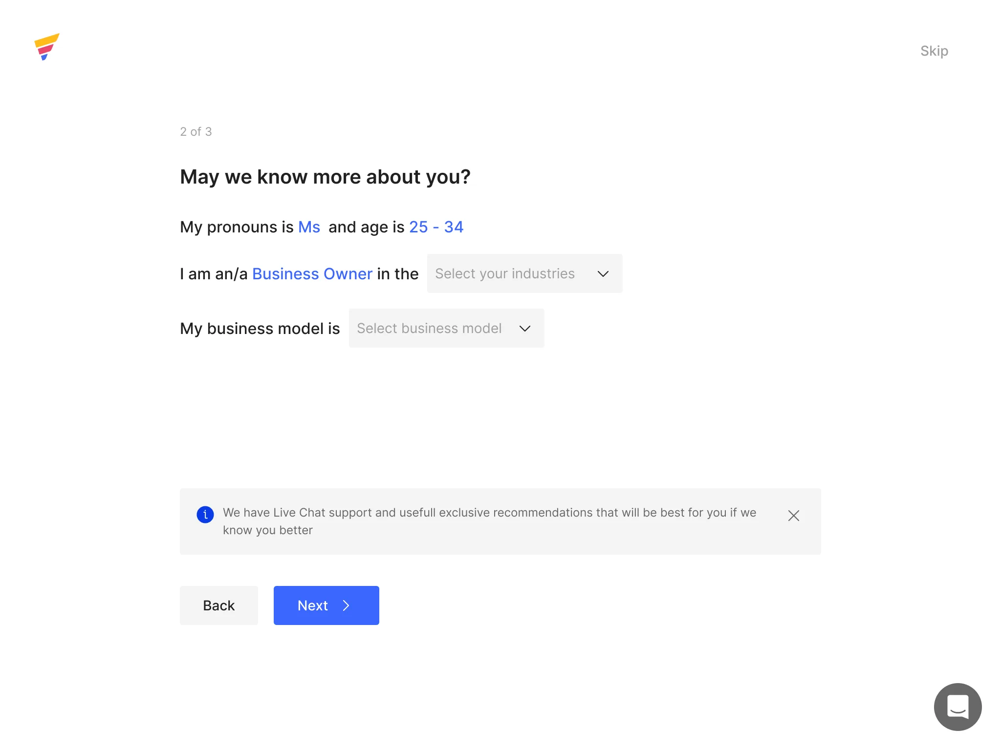
Five testers, and my first draft didn't survive
I tested the prototype with four customers and one in-house marketer who wasn't on the project. All five hesitated at title and age, even with a reason printed underneath. They also rushed through every question, barely reading the options, so the answers wouldn't be worth much.
I reviewed every recording before proposing the final flow. Those findings drove the decisions below.
You're not collecting this to sell it, are you?
Four calls that shaped the shipped flow
01
Ask only what helps users build their first page
- Insight
- Users install GemPages to build a page. Nothing else changes their first session.
- Decision
- “I want to build a…” opens the editor on that page type. “What are you selling?” puts the user's industry first in the template library.
- Trade-off
- We lost self-rated experience, but it was unreliable (is three months on a competitor beginner or intermediate?) and wouldn't change the product: the Head of Product wanted one app for both. Customer support's monthly reports cover it instead.
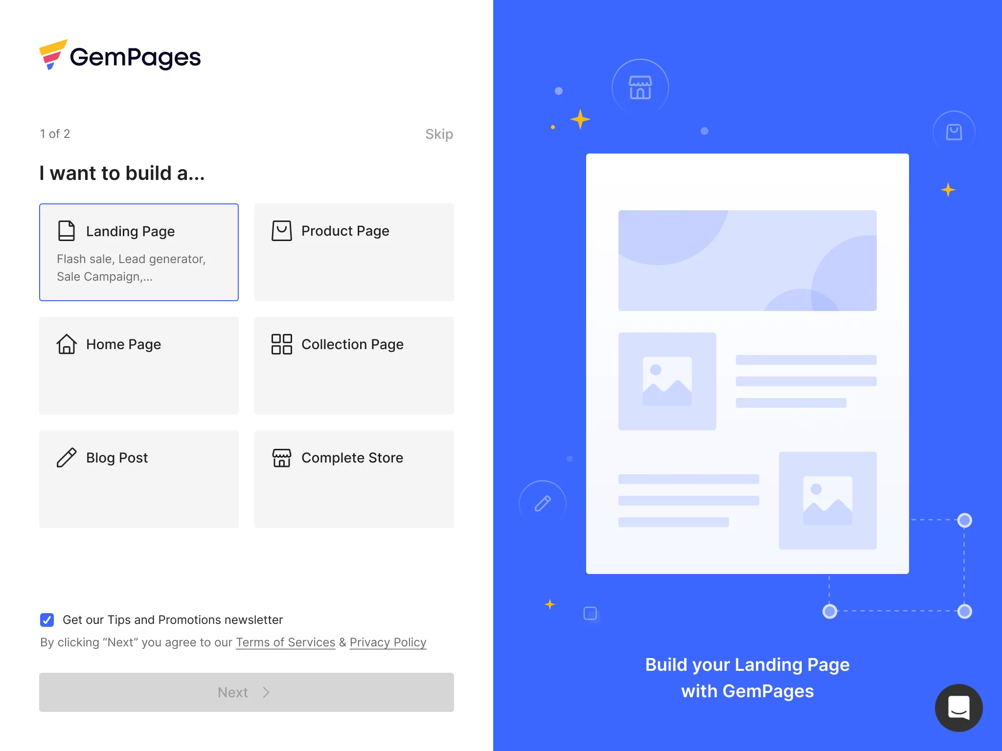
(Hovering an answer previews that page type) 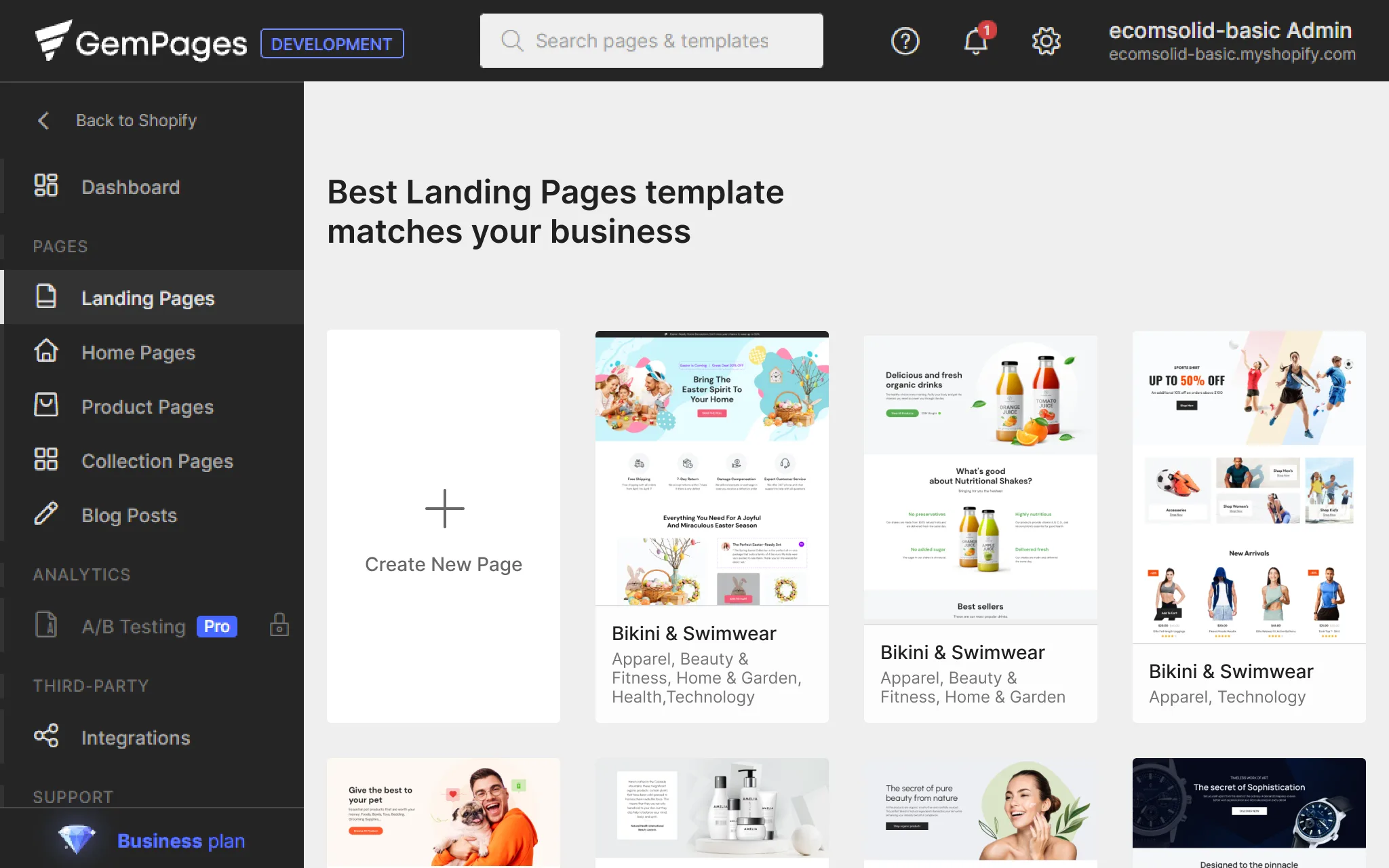
(Templates sorted by the industry users picked) 02
Ask marketing's questions later, and give something back
- Insight
- Role and business model mattered to marketing, not to the user's first session.
- Decision
- I proposed moving them to a dashboard survey, answerable any time, with a reward. The UX lead suggested the reward: an e-commerce handbook matched to role and business model. Anyone can choose “Later”.
- Trade-off
- Fewer people answer, which worried the marketing leader. I argued for quality over quantity: answers given by choice are more honest than answers squeezed out at the door, and these two were never marketing's core data.
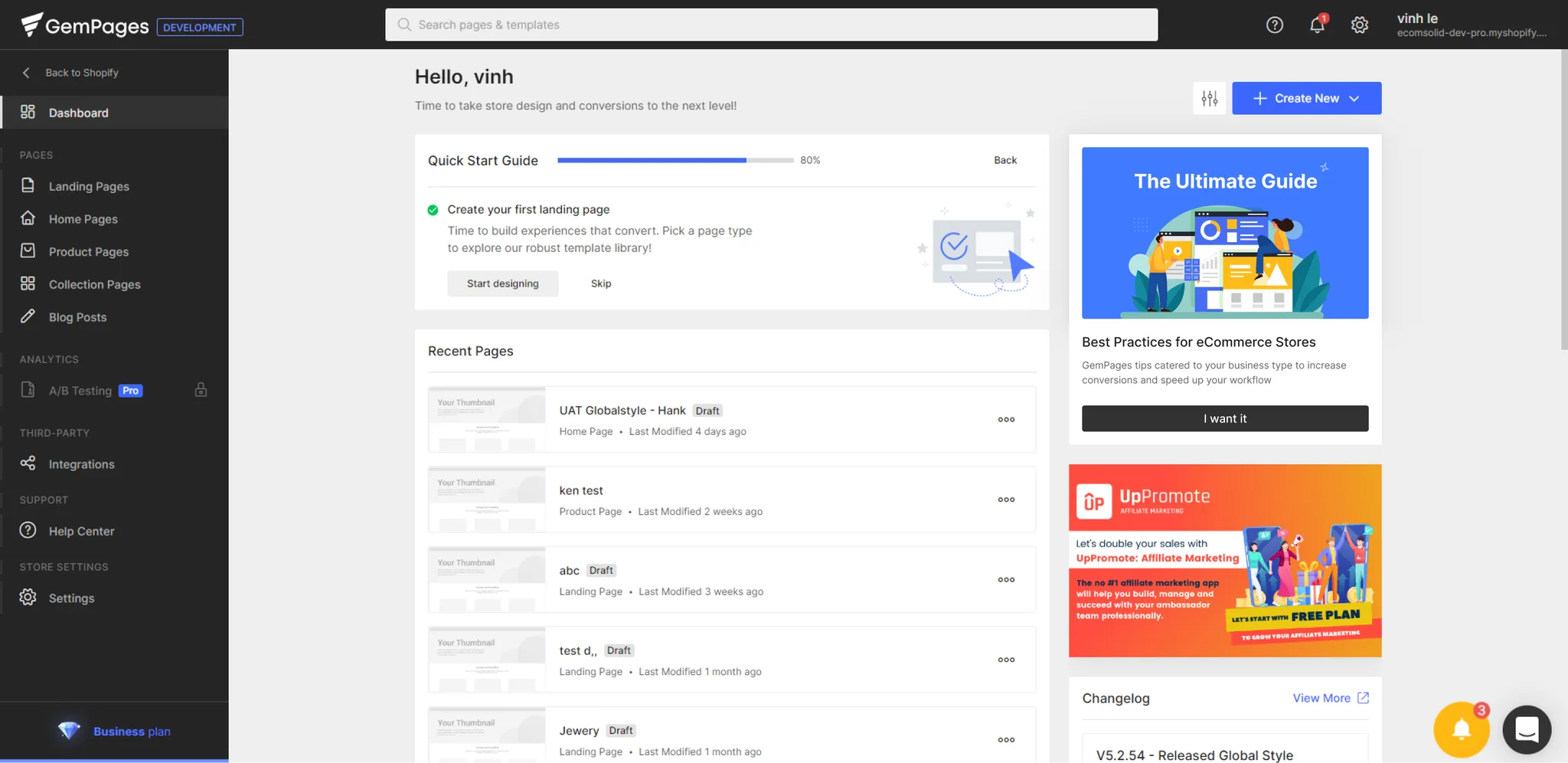
(The offer, on the dashboard) 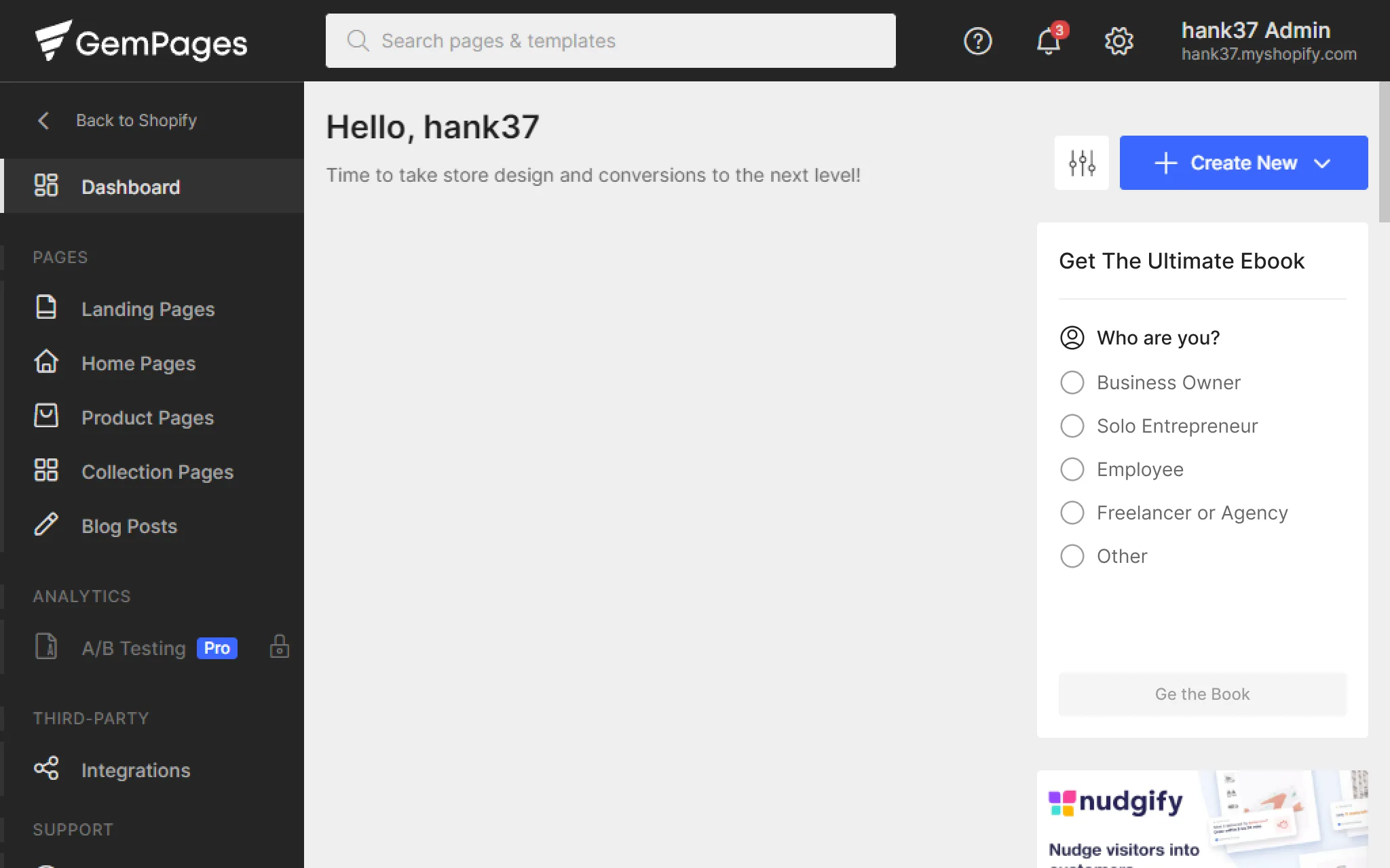
(Two questions, then the e-book by email) 03
A skip on every step, and the end in sight
- Insight
- Users who couldn't leave the questionnaire left the app.
- Decision
- Every step has Skip, on the same line as a “1 of 2” counter, so the way out and the end are visible together. Skipping lands users in the editor.
- Trade-off
- More skips means less data. A user who skips into the editor is worth more than one who uninstalls with a complete profile.
04
Use Shopify's words, not ours
- Insight
- Users couldn't find themselves in our overlapping roles and jargon-heavy industries.
- Decision
- Industry is multi-select: pick a suggestion or type, and a dropdown offers the closest matches from Shopify's own categories and keywords. If nothing matches, the user's words become a tag.
- Trade-off
- Free text doesn't map itself, and developers wouldn't invest in data tooling, so my plan was to map it by hand: slower, but better than forcing people into the wrong category.
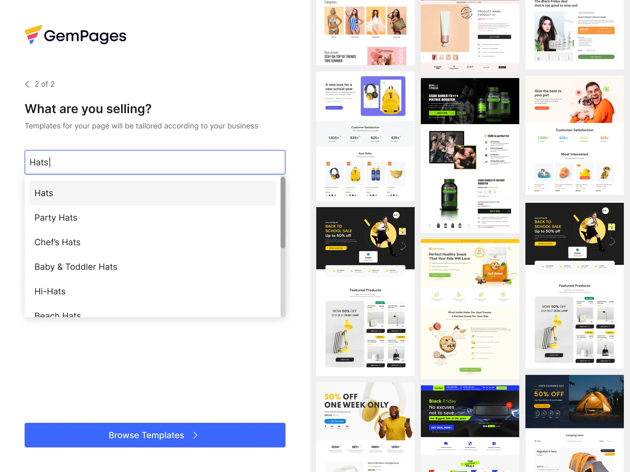
(Typing searches Shopify's keyword list)
One requirement I pushed back on, one idea I let go
Age and gender were in the marketing leader's brief, and in my first draft. After the test I proposed dropping them: sensitive, no help in building a page, only slightly sharper ad targeting. The UX lead agreed, and the test findings convinced the marketing leader.
I wanted hovering an answer to play a drag-and-drop animation building that page type. Developers pushed back: slow to play, complex to build, and a GIF wouldn't scale. We shipped their static fade-in preview instead. At the first step, speed mattered more than my animation.
What I'd carry forward
01
Test the brief, not just the design
My first draft still asked everything on marketing's list. Five sessions showed what that cost, and convinced the marketing leader better than my arguments.
02
Self-reported data is weak data
Testers rushed questions that gave nothing back. If an answer doesn't change what users see next, watch what they do instead.
03
Replace gut feel with real signals
Customer support's reports are mostly gut feel. I'd define first-week signals, such as features used or time to publish, to see who struggles without asking.
Next case
- I designed a prayer app and shipped it without writing a line of code
- —